Welcome back to Make It Nice, Defector’s best interior design advice column. Today we have a cavernous bedroom, a tricky living room layout, and a ’70s bathroom. Let’s get into it.
Rein asks:
My fiancee and I are renting in Chicago. Our unit had been renovated in the past so the primary bedroom is rather large. The apartment is incredible, but the size of the bedroom requires quite a bit of furniture to make it feel lived-in and not cavernous. We already had some furniture (the white nightstand and dresser and the mirror), found some pieces on FB marketplace (white armchair and red end table), and our landlords gave us the very nice wooden dresser. However, our current layout and/or the combination of items still feels stilted to me. How would you rearrange or redecorate our bedroom to improve it?
This room is massive! How luxurious! I like what you’ve done so far and will assume that the furniture you have in there right now is serving your storage needs. It does sort of feel like your furniture is just floating in the room, though. I think a rug under the bed would make a huge difference in this space. You’d need a big one, at least a 6×9, but ideally an 8×10, so that you can completely surround the bed.
Where you buy a rug is highly dependent on your budget. If you want to keep it to a couple hundred bucks, RugsUSA and IKEA are your friends. If you’re willing to spend more, look at Revival Rugs and Nordic Knots. You’ll want the color of the rug to contrast with the floor, but not too much. Use the colors in the art pieces in your bedroom as your guide. Look at deep blues, greens, and maroons.
While we’re on the topic of art, you should get more of it! The wall above the wood dresser needs some sort of medium-to-large scale piece. The empty space next to the armchair is the perfect spot for a mirror. IKEA’s Hovet mirror would look great leaning up against that wall, and I feel like I always see these for under $100 on Facebook Marketplace.
As you shop for a rug, make some time to go see them in person at a CB2, IKEA, or a local rug showroom in Chicago like Cozy Rugs. This window shopping is important because you and your fiancee can feel out what you like in terms of color, material, and pile (aka fluff level).
Michael asks:
My 4-person family has a small-ish living space on the back of our house. We’ve spent some time remodeling the space and adding new furniture in the 7ish years we’ve been here, but the living room has been a bit of a question mark for us. The main problem is that it has three doors: one leading to the breakfast nook then on to the kitchen, another into a hallway, and french doors onto our screened-in porch.
I struggle to know what to do with this space. I dislike how little floor space there currently is (kid bomb notwithstanding) and I really don’t like how the TV placement cuts a big chunk of the corner off that room. Please help! I’ve attached some photos that (try) to get you a lay of the land.
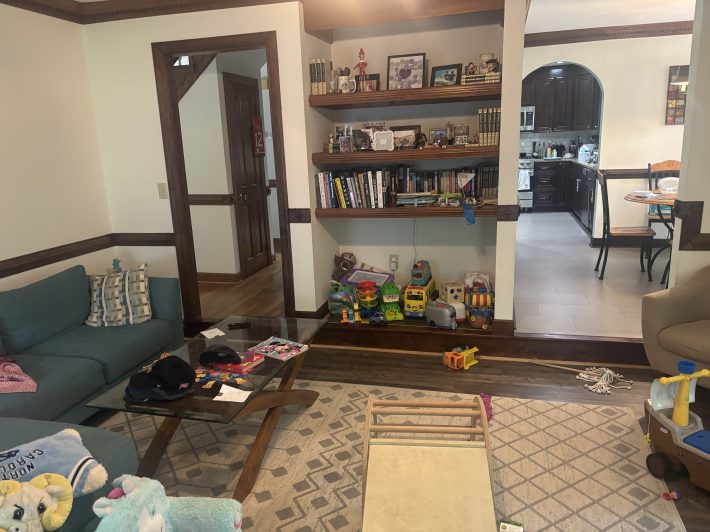
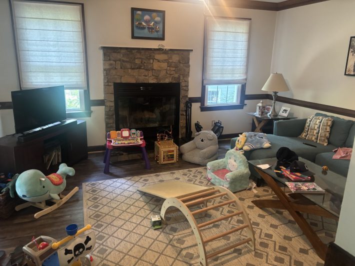
I see why this room has stumped you. There’s so many traffic patterns to account for. I only see one way to lay out this room and it relies on my assumption that you spend more time looking at the TV than the fireplace. Flip the couch and float it at the center of the room, facing the only uninterrupted wall. Ditch the media stand and mount the TV on the wall. This saves you floor space and means you can push the sofa a little closer to the wall, opening up more floor space behind the sofa where you can put most of those toys.
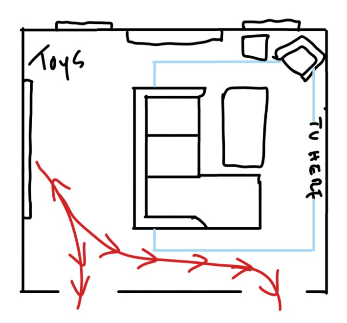
In my very rough sketch of your room, I moved the arm chair to the corner where your side table is now. I think you have enough room to keep the side table next to the arm chair but you’ll have to see how that looks. You may find that the side table looks big there and in that case, you can find something smaller or just get a floor lamp. You’ll also want to rotate your rug so that it touches all the living room furniture (at least the front two feet). Don’t underestimate the power of a well-placed rug!
This layout creates clear zones: A TV zone, toy zone, and clear walking paths that don’t disrupt either zone. Do some measuring before you start to move stuff! Based on your photos, if you line up the back of the couch with the edge of the fireplace you should have plenty of space in front of and behind the couch.
Ami asks:
I’m absolutely loving the column! My husband and I are purchasing our first home—the duplex we currently live in (lucky us!!). It’s a historic building that was completely gutted and renovated in the ’70s. Some updates have been made since then, of course, but a lot of that character still shows—and we love it! We’ve started fantasizing about what house projects we could take on, but whatever we do, we really want to preserve as much of the quality, original material as possible.
So, my question: The bathroom is somewhat at odds with the rest of the house, stylistically. It’s much more masculine and hard than the rest of the apartment, which has a very open, organic feel. I almost think the bathroom belongs in some fancy hotel lobby. Do you have any recommendations for how we could update the bathroom to soften the vibe and make it more home-y (but still cool), without just doing a full gut? In particular, we know the granite tile is dated, but it’s high quality. What can we do to work around the tile to bring the space into the 21st century? How far could a new paint color and updated fixtures take us?
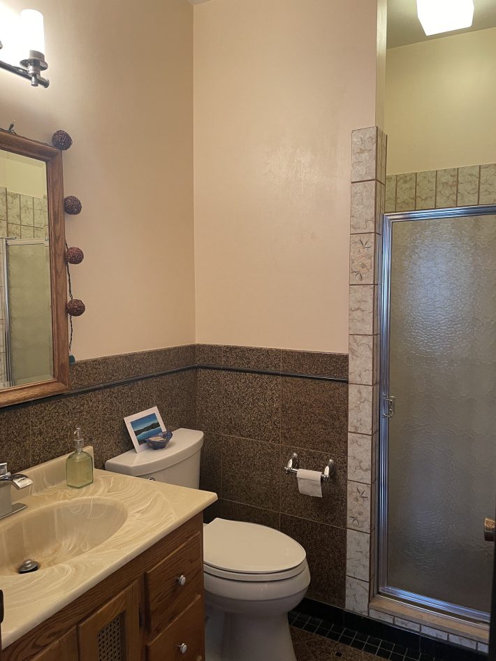
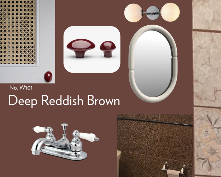
I hear you on the “hardness” of this bathroom. The granite tiles are definitely intense. If you’re set on keeping the tiles, I think you need to lean into them with a moody paint color like a dark, rich brown. The winning color, in my opinion, is Farrow & Ball’s deep reddish brown. This saturated shade is going to help dilute the intensity of your tile.
I know you want to soften it up and have it feel less masculine, and you can do that with the fixtures and other accessories. The color of your tile really boxes you into the brown/beige color family, and you’ve already seen that beige walls don’t do you any favors in this room.
Below are three examples of brown bathrooms with white fixtures and softer accents. The first of the three photos shows the exact paint color I recommended. You’ll notice that all three bathrooms are completely washed in the color, doors, and ceiling included. That’s what you should do in your bathroom, too.
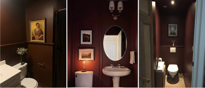
I’d replace your current mirror with something round or oval with a metal or lacquered frame, and get a two-light fixture to hang above it. Your shower door has a shiny chrome frame, and I think you can fully lean into chrome for the other fixtures as well. If you’re not ready to replace the vanity yet, just paint it white and replace the knobs with something shiny. The marbled sink top is kind of cool, and it will look even better once you paint the room.
Make sure all the lightbulbs in the bathroom are the same color temperature. I recommend a warmer 2700K. People tend to default to bright white light for bathrooms, which just gives me operating room energy. It really kills the vibe!
Even though we’re really just talking about paint, I recognize that this is a big change. I suggest you do a bit of mood boarding and IRL window shopping. Get some big paint swatches and tape them up on the wall so you can get a feel for them.
Also, if you decide to go with the color I chose: Don’t pay the premium for Farrow & Ball paint, it’s not worth it. Just take the sample to your local hardware store and have them color match.
Want my help? Send me an email with your design question and some photos to [email protected].